Creating Covers
Publishing through KDP? Here are some
hints for creating your front
cover. Most importantly, your book will most often be
displayed postage-stamp sized on screen. This means your title must be easily legible
when viewed at this size.
PROBLEMS


Pick a clear, commercial fonts that stands out nicely against your
background image. In the first image, the title and author are tiny and have entirely
disappeared. In the second image the author is legible, the title stands out a little
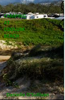
better, but the word beach blends in too much with the photo. The photo in the
first image is not very exciting and… I think it’s a camping area maybe near a
beach? The second shows the beach a bit better but the camping area has
disappeared into nothing but a white blotch in the distance.
For your background picture, this also needs
to be clear when viewed as a tiny image. If you have a multitude of tiny
pictures they could disappear into a collage of nothing, so don’t
over-complicate it. Make sure your picture attracts attention and actually relates
to your book. The image needs to make a reader curious, it needs to be
attention grabbing. Choose a cover image that draws the eye when viewed among a
grid of book covers.
Your cover must be good quality. It is
the first thing people see when browsing. Your home
drawn image is unlikely to be good enough unless you are a professional artist.
Same goes for photos. You can buy great quality images on-line in sites such as
www.shutterstock.com or www.istockphoto.com. PAY FOR
THEM. There are various ways of stealing photos on-line but that would be… duh!
Stealing. Remember, you will be really annoyed if people start uploading your
book for free, when you have put in the effort of writing a fantastic book.
Photographers feel the same way.
Have a look at other covers on Amazon. See
what other people have done and take note of what captures your attention.
Here is a highly embarrassing comparison
of my first attempt at making covers and my revised covers.
The photos used for the first three are honestly pathetic. Whilst they were nice photos and free because I took them whilst camping at Goomburra National Park, they are not interesting, they show nothing about the books, they are not attention grabbing and they are not high quality. Fail, fail, fail, fail. The writing is legible, but not impacting or suitable for the type of fantasy adventure contained in the books. They are boring. There is nothing about them that would make me want to read the books.


I improved somewhat with my second
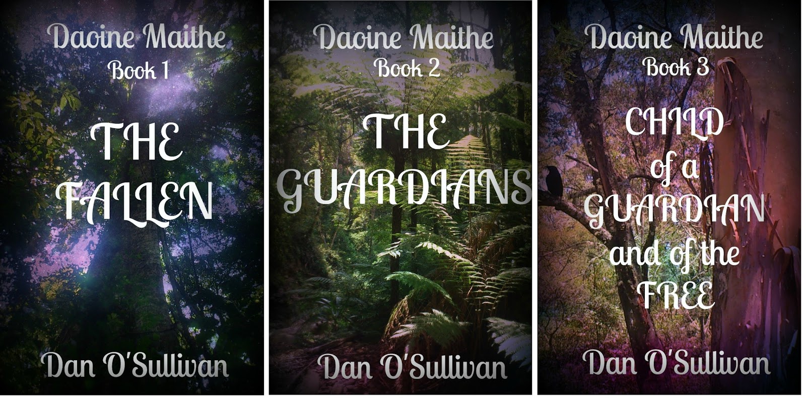
attempt. The images actually relate to the story. They are purchased images,
and they are high quality. The model in the first image seems to be looking at
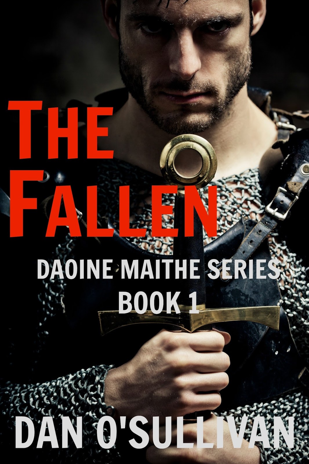
the buyer, daring them to buy the book, ha ha! He has a bit of a dangerous
look, which suits the characters in The Fallen nicely. The model in the second
image (The Guardians) is interesting in a gentle manner, which also
relates perfectly to The Guardians in the series, and the clothing worn by the
model, tunic, gauntlets, sword, face partly hidden by hood, hints at medieval
fantasy/mythology. The image used for the third book showing a beautiful woman,
skilled in archery, about to shoot her arrow at the unknown, is attention grabbing because the woman is lovely and she is doing something eye-catching.
The fonts look good, are easy to read
and the colour stand out well enough to be easily read when reduced in size. Whilst not perfect, these covers are a huge improvement on the originals.
Don’t be afraid to get someone to design your
book covers, just make sure you specify exactly what you want to suit selling as
a postage sized title.
Here are some covers I had designed by a
professional for my upcoming Ruby Key series for middle grade. I am yet to
decide if the titles are too “squashed”.


Get Dan O'Sullivan's Trilogy on Amazon
Book 1 - The Fallen
Book 2 - The Guardians
Book 3 - Child of a Guardian and of the Free


Comments
Post a Comment